Your Dashboard Overview
Pro+A guided tour of the Kwiro dashboard -- see your AI's performance, revenue impact, and customer conversations at a glance.
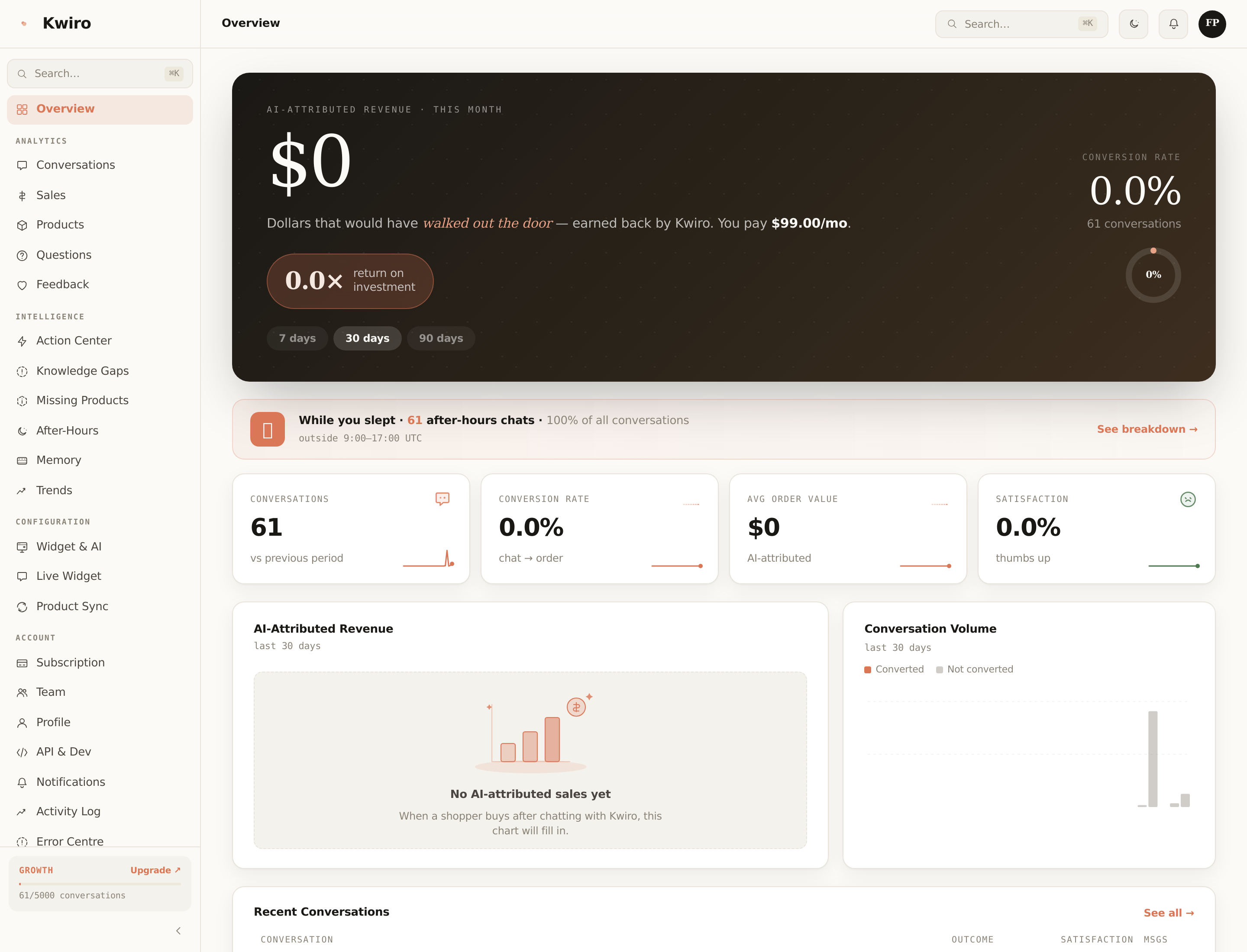
Your AI Sales Performance at a Glance
The Kwiro dashboard shows you exactly how your AI assistant is performing. Think of it as a report card that answers one question: "Is my AI actually helping me make more sales?"
How to Access Your Dashboard
You can reach your dashboard in two ways:
- From WordPress: Click AI Sales Assistant > Dashboard in your WordPress sidebar. The dashboard loads right inside your admin area.
- From anywhere: Log in at app.kwiro.ai to check your stats from any device, including your phone.
Both options show the same data.
The Main Dashboard Screen
When you open the dashboard, you see your key numbers displayed prominently at the top:
AI Revenue This Month
This is the star number. It shows the total revenue from orders where your AI assistant helped the customer. When a shopper chats with Kwiro and then makes a purchase, that revenue is tracked here. This is the clearest measure of your AI's value.
Conversations
The total number of chat conversations your customers have had with the AI this month. More conversations generally means more opportunities for sales.
Conversion Rate
The percentage of AI conversations that led to a purchase. For example, if 100 people chatted with the AI and 5 of them bought something, your conversion rate is 5%.
Average Order Value
The average total of orders that were influenced by the AI. This helps you understand not just how many sales the AI drives, but how valuable those sales are.
ROI Indicator
This is your return on investment. It compares what you pay for Kwiro to what the AI has earned for your store. For example, "You pay $39/month. Your AI earned $1,200 this month. That's a 31x return."
Below the Numbers
Scroll down to see:
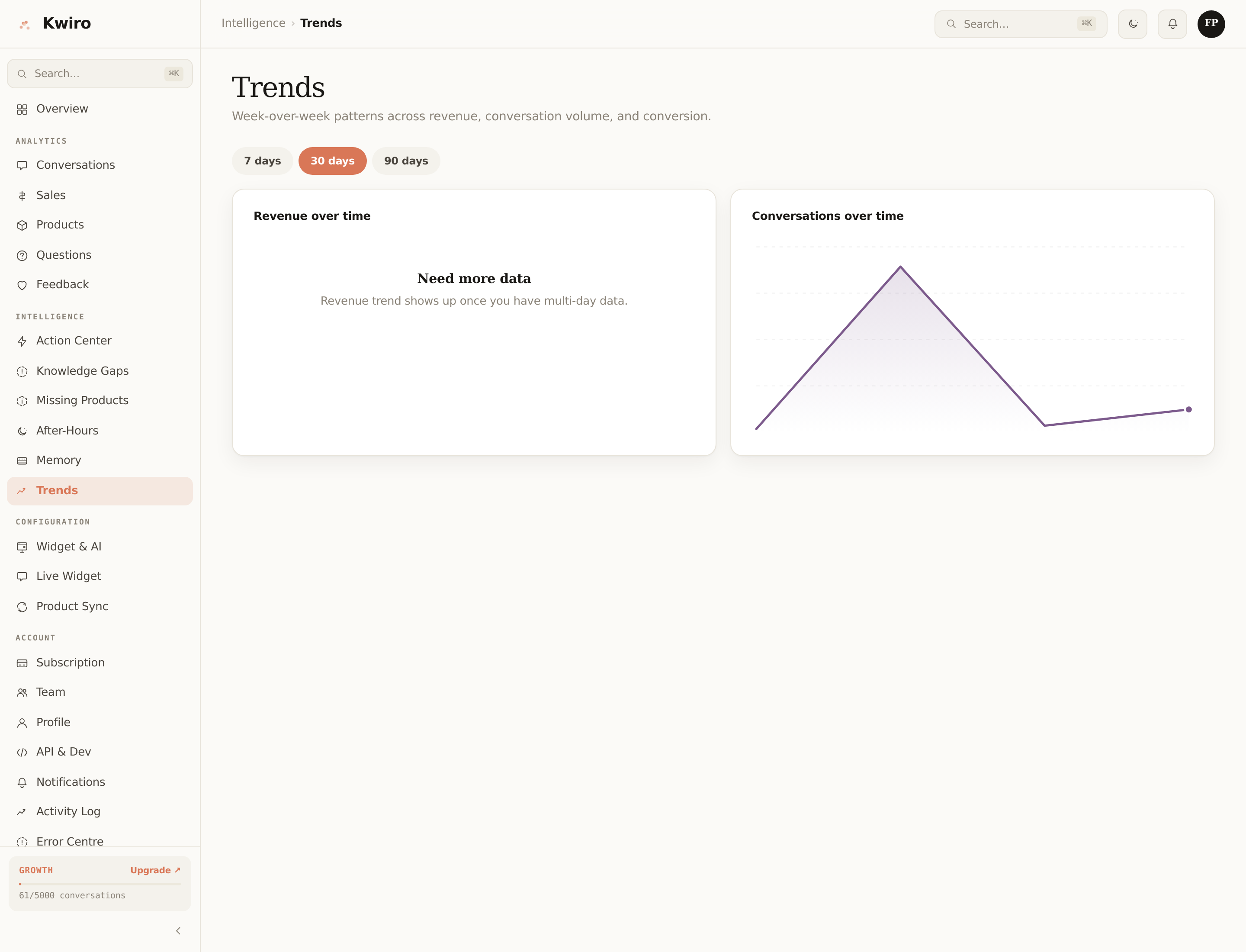
- Revenue chart -- a visual graph showing AI-attributed revenue over time, so you can spot trends
- Top products -- which products your AI recommends most and which ones customers actually buy
- Recent conversations -- a quick look at the latest customer chats, so you can see what people are asking about
Changing the Time Period
Use the date range selector in the top-right corner to view data for the last 7 days, 30 days, 90 days, or a custom range. All numbers and charts update automatically.
Related reading
Getting Started
What is Kwiro?
Learn what Kwiro does, who it's for, and how it turns your WooCommerce store into a 24/7 sales machine.
ReadCustomization
Customizing Your Widget
Match the Kwiro chat widget to your store's brand with custom colors, position, welcome message, and bot name.
ReadSmarter AI
Memory Inspector
Pin, edit, or delete what your AI has learned. The unique tool that lets you control the patterns Kwiro uses to sell.
Read