Understanding Your Analytics
Pro+Learn what each metric on your Kwiro dashboard means and how to use analytics to grow your sales.
What Your Numbers Actually Mean
The Kwiro dashboard tracks several metrics. Here is a plain-English explanation of each one and why it matters for your store.
Revenue Attribution: Direct vs Assisted
Kwiro tracks two types of sales:
- Direct sales: A customer chatted with the AI, clicked on a product card the AI recommended, and bought it. This is the clearest connection between a conversation and a sale.
- Assisted sales: A customer chatted with the AI, did not click the product card directly, but came back and purchased within 24 hours. The AI influenced the sale even though the customer took a slightly different path to checkout.
Both types appear in your dashboard. Direct sales are labeled with a shopping cart icon, and assisted sales are labeled with a handshake icon.
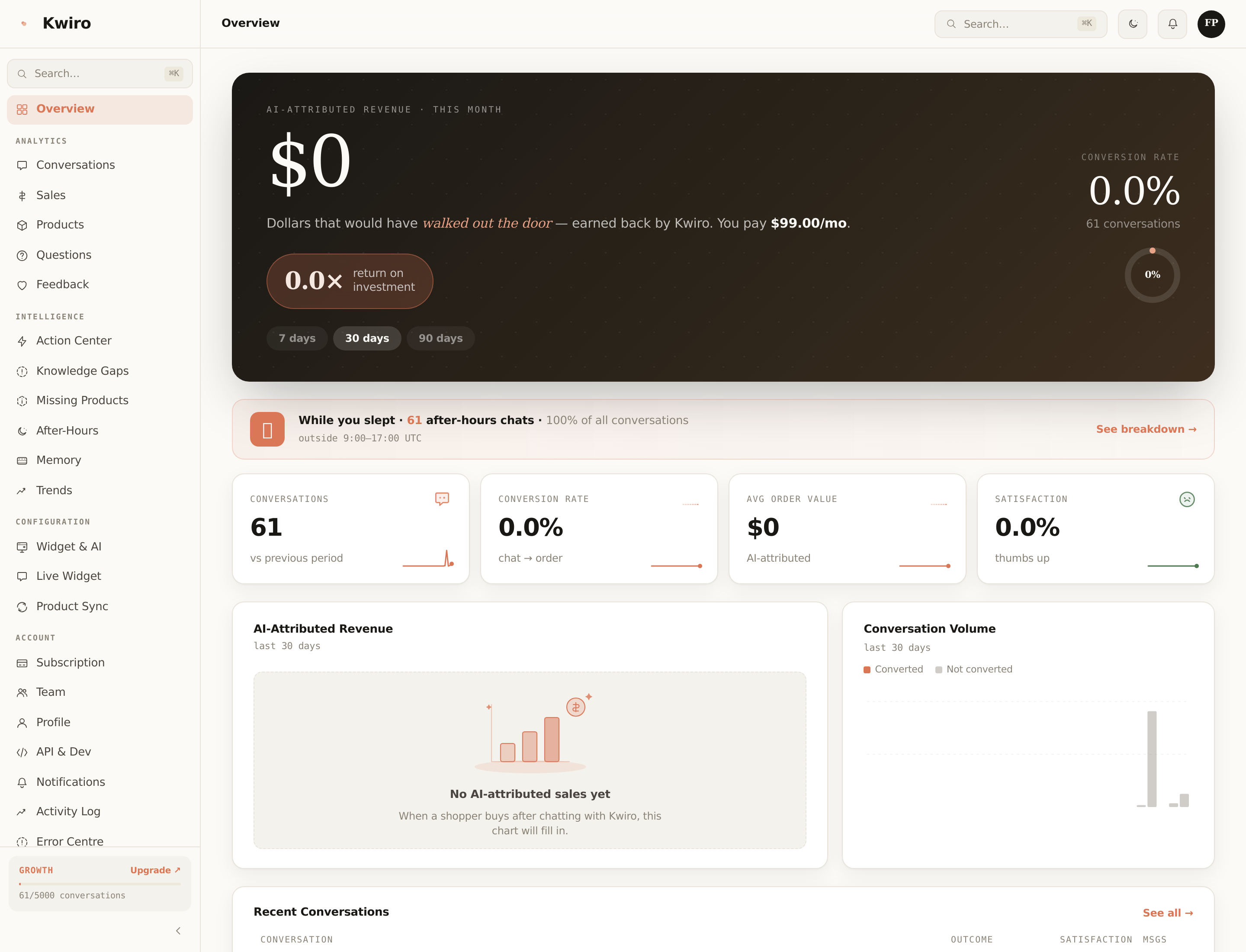
Key Metrics Explained
Conversations
One conversation is a complete chat session between a customer and your AI. If a customer asks three questions in a row, that counts as one conversation. If they come back the next day, that starts a new conversation.
Conversion Rate
The percentage of conversations that resulted in a purchase. Industry average for live chat is around 3-5%. A healthy Kwiro conversion rate is 5-10%, and it improves over time as the AI learns your store.
Customer Satisfaction
After a conversation, customers can give a quick thumbs up or thumbs down. This score shows the percentage of positive ratings. Aim for 80% or higher.
Top Products Asked About
This list shows which products customers ask about most. If a product appears here often but has low sales, its product page or description might need improvement.
Top Questions
The most common questions your customers ask. This is valuable market research -- it tells you what your customers care about and what information might be missing from your product pages.
Using Date Range Filters
Click the date range selector in the top-right corner of any dashboard page. You can choose:
- Last 7 days -- great for checking recent performance
- Last 30 days -- the standard monthly view
- Last 90 days -- for spotting longer trends
- Custom range -- pick any start and end date
All charts, numbers, and tables update when you change the date range.
Exporting Your Data
On the Sales and Conversations pages, look for the Export button in the top-right corner. You can download your data as a CSV file to use in spreadsheets or share with your team.
Related reading
Getting Started
What is Kwiro?
Learn what Kwiro does, who it's for, and how it turns your WooCommerce store into a 24/7 sales machine.
ReadCustomization
Setting Your AI's Personality
Control how your Kwiro AI assistant talks to customers -- from professional and formal to friendly and casual.
ReadSmarter AI
Memory Inspector
Pin, edit, or delete what your AI has learned. The unique tool that lets you control the patterns Kwiro uses to sell.
Read